This document offers some guidelines for the design of the user- interface and the preparation of the associated report. It assumes that the initial project requirements have already been agreed upon. The requirements stage described the proposed product, its objectives and potential users. It also produced a set of functional specifications which stated what the user wanted/needed to be able to do. Once we have refined the requirements to the point that we are sure we have not overlooked anything vital, the next stage is to decide exactly how the user will achieve the things he/she wants to do. In other words, what will users see and how will they interact with the program in order to achieve their goal. This is what the user-interface design stage is concerned with.
It is important to make things as simple and as natural as possible for the user. Remember, if you had forgotten some critical feature in the requirements stage, users would not be able to do what they needed to and hence wouldn't buy your product or, having bought it, would be unhappy and would certainly not recommend it to anyone else. Assuming that you will provide the functionality the user needs, it is still important to make it as easy as possible for them to achieve their goals. Users will always prefer well-designed products, that is, products that are easy to learn and simple to use. Since most products can be expected to provide the required functionality, the user- interface is arguably the most important part of the design and can make or break the product. For this reason, time spent thinking about and detailing the user-interface, is time very well spent.
Remember, the objective is to make things easy for the user (not you, the programmer!) Therefore, at least to begin with, forget about how you will actually write the program and concentrate on the user's needs. Put yourself in their position. You know (from the requirements stage) what things they want to be able to do, so now think what is the easiest, most natural way for them to accomplish these things. There are really two facets to consider. The first is organisation. Grouping related functions together makes the program seem conceptually simpler and thus makes it easier to learn and to use. The second consideration concerns the actual sequence of operations the user must perform in order to do a particular function. For example, can they simply move the mouse to a button and click, or do they have to type in a three letter command and press the enter key; can they select from a list of possible filenames or must they remember and type in the desired filename. In each of these cases the answer may seem obvious but it needn't be. For one thing, not so long ago, it wasn't clear that there were other options. Designers simply did not think too much about the user and felt no remorse at expecting them to remember and correctly type in lots of cryptic commands (c.f. Unix!) Another factor which may influence your choice is the intended environment. Under MSDOS there were few conventions, however, if you are integrating software into an existing system then it should function in essentially the same manner. Under MSWindows this is certainly the case. Users expect to interact with programs in certain ways (through the use of standard menus, dialogs, etc.) and your program would probably do well to observe these conventions so that users can utilise their existing knowledge and skills, and start making use of your software very quickly. Finally, it is very important that the user-interface is consistent within the program too! If the user must do the same sorts of things in different places then the method of accomplishing these should also be the same; it is only going to confuse people if some buttons require a single left mouse button click, others a double click and still others a single right click; or if there are several different dialogs that perform essentially the same task, but are accessed via multiple alternate paths!
The following is based on the example of an "An Electronic Aid to Text Understanding" developed in the document detailing the requirements stage. The user-interface for only a few of the required facilities is described here, just to give a flavour of the sort of things you should include in your report.
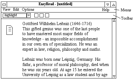
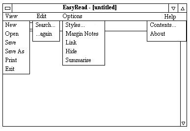
The Menus
The diagram below shows the menu structure. The user will normally start by selecting the View/New option. This will display a standard FileOpen dialog from which the user can specify the file (generally a text file) which he/she wants to mark-up. The contents of the file will then be displayed. When the user has finished marking-up, the resulting "view" can be saved using View/Save. A standard FileSave dialog appears allowing the user to specify the name of the view file (which must be different than the original file!) The default extension for view files is ".er". To examine or edit an existing view, simply choose View/Open and then select the required view file from the FileOpen dialog. Changes can be saved to the same view file using View/Save or to a different one using View/SaveAs. View/Exit closes the program, prompting the user to save first if any changes have been made. The View/Print option provides various printing capabilities...
Assuming that we have previously explained the functioning of all the menu options, we now move on to the text selection procedure which is an essential prerequisite for most of the text mark-up operations. Make sure you use the right user-interface components for the right job. In particular, use radio button groups for mutually exclusive alternatives, check boxes for multiple on/off selections, and labels for read-only text, but textFields for data entry. Again, look closely at some existing programs to see how they provide various forms of interaction.
Text Selection: To select a block of text move the mouse cursor to the start of the desired block and press and hold the left mouse button. Now still holding the button down, move the mouse to the end of the required section. As the mouse moves the enclosed text will appear inverted. Releasing the mouse button fixes the selection.
Text Mark-up: This facility enables text to "marked-up" (displayed) in various styles, e.g. underlined, green highlight, re-write, etc. The user simply selects the text to be marked and then chooses the desired style either from one of the standard speed-buttons on the toolbar or from the combo-box on the toolbar. The text is immediately redisplayed in the new style.
The user can add new styles to the combo list (or edit or delete them) by selecting Style on the Options menu...
User-interface design is probably still more of an art than a science. Although there is a lot of literature on the subject, the best guide is probably common sense. Put yourself in the user's position and think what you would want. Take a look at other programs and carefully note how they do things, then copy them or better still improve on them if you can. In particular, notice how successful programs provide (a) good feedback, so that the user knows when they have done something, (b) good navigation features, which means of indicating where the user is and how they can get to where they want to be, (d) a way to undo anything, and (c) consistency. Oh, and they generally look good too; aesthetics are very important!
Many programs, especially web-based programs, have multiple "screens" which the user must navigate between. It is vital that the user always knows where they are and how to move to any desired feature; thus context, navigation facilities and consistency are particularly important. Always show a meaningful title (and perhaps sub-title) that tells the user where they are. Provide a navigational facilities, buttons, a menu or, perhaps, a "breadcrumb" trial that shows the user how they got to the current screen and (very important) provides a way back! Above all, be consistent. Use the same font face, size and colours throughout the application. Always put things (especially navigational elements, such as the "Back" button) in the same place on each screen and use the same images each time so users can be sure to recognise them! If your project has such a multi-screen structure, include a "map" of it in your report, to graphically illustrate how the various screens are linked together.
Essentially you can view your report as the user manual for your program. Although many commercial products do indeed provide such a document to their users, simply listing the features (as suggested above) may not be the most appropriate form. A good user manual really ought to explain to the user how to do the things he/she needs to do; take a look at the Delphi manuals, for instance. On the other hand, a functional listing is still valuable, particularly for the on-line help system, hence the time and effort you spend here will not only ensure that the implementation stage goes smoothly, it can also form the basis for the help option.
Finally, don't forget the previous advice about writing reports and in particular about the title page and spell checking! I expect this report to be much longer than the last one, ten pages or more would not be surprising. Make sure you begin with a short explanation of your project, since readers may not have had the opportunity to read your requirements report. I recommend you use MS-Word since it is relatively easy to include diagrams showing the how the screen will look to the user. Simply click on the button with a little triangle, square and circle on it (or select Views|Toolbars|Drawing) to access the drawing options.. This will allow you to create and edit such diagrams very easily. You can use copy and paste to create duplicate images that you can then edit as necessary for each successive figure. Alternatively you can create and use images from Windows PaintBrush if you want. Better still, perhaps, use a Visual Java IDE (such as JBuilder) to make mock-ups of the interface, then capture these (by pressing Alt-PrintScreen) and paste them into your report (after editing them first, perhaps.) Be warned though, such gif/jpg/bmp images can occupy a lot of disk space!
(c) 1996-2001, 2004 David Davenport
----------------- O -----------------