Microarray Data Analysis with PATIKAmad
Microarray technology helps us figure out the expression levels of thousands of genes in the cell simultaneously for different conditions. Nowadays microarrays for different species are emerging and the existing ones are being improved, resulting in more and more microarray experiements getting done.
PATIKAweb has a comprehensive microarray data analysis component named PATIKAmad, implemented as an applet and integrated into its powerful visualization environment.
Loading Data
PATIKAmad has a native expression data file format (.pmad) and supports conversion of tab-delimited data files into this. This is an XML-based format containing information about the experiments (description and values to be analyzed). Previously created pmad files can be directly loaded into PATIKAmad. Upon load, all visualized objects are associated with the first experiment in the loaded data file. As the pathway models change on new queries for instance, the loaded data is associated to any newly introduced objects whenever possible.
Visualization of Microarray Data on Pathways
In PATIKAmad it is possible to map microarray data onto bioentities in a bioentity view and simple states in a mechanistic view. This mapping can be visualized by color-coding and/or labeling the view objects.
Following are pathway views, where loaded microarray data has been mapped onto the pathway model objects.
)
)
Configuring Visualization Settings
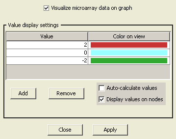
Visualization options for microarray data can be configured using "View Settings Dialog" in PATIKAmad. You can specify any number of colors and corresponding values for desired color-coding. Then in-between values are displayed with in-between colors computed accordingly. Optionally values can be displayed on related pathway view objects as labels.
Microarray Data Management
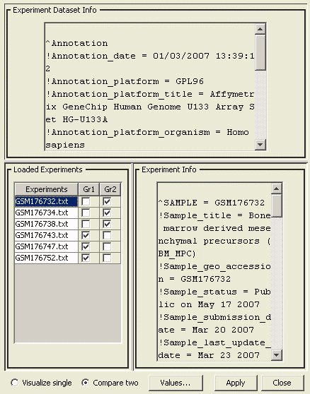
When multiple experiments are loaded into PATIKAmad, the user may choose which group of experiments to be averaged or which two groups of experiments to be compared. This is done using the "Microarray Data Management Dialog".
Querying with Values Table
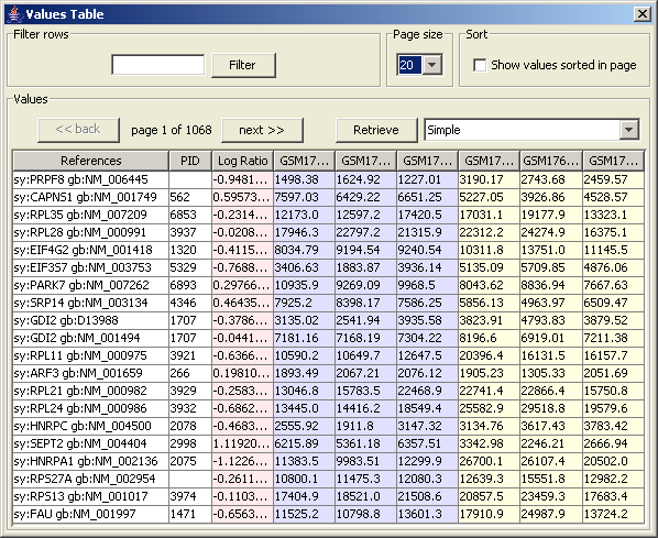
Values table displays the rows of the loaded microarray data. This table color-codes the experiments to be averaged and/or compared. A separate column is used to show the calculated values that are displayed on the graph. It is possible to sort the values on this table according to the values and/or filter rows according to their references.
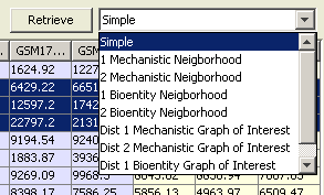
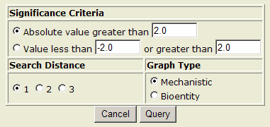
Graph-of-Interest Query using Significant Microarray Values
A graph-of-interest query may be used for discovering links between significantly expressed (or differentially expressed) nodes. The user needs to state their criteria of significance, limit of path length between nodes to search, and type of the result graph.
Cluster Analysis
The purpose of microarray cluster analysis is to group genes on the basis of similarity/dissimilarity of their expression profiles. As microarray experiments get more widely used, they become more and more dependent on cluster analysis and other biostatisticial methods since it is almost impossible to make sense of expression profiles of thousands of genes manually. Cluster analysis of microarray data has already demonstrated great potential for disease identification, finding genes responsible for specific diseases and drug discovery.
PATIKAmad is unique in its integrated tools to perform cluster analysis and visualize the results as partitioned pathways.
Prior to performing cluster analysis, raw microarray data needs to be converted to native format (".pmad') and loaded as described earlier. Below is a step-by-step illustration of performing cluster analysis and visualizing its results as a pathway.
Filtering, Normalizing and Clustering Microarray Data
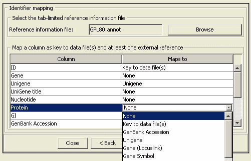
We assume a basic understanding of normalization and clustering methods. For this illustration, we will use "GDS170" data set downloaded from NCBI's GEO database (more information about this data set). We assume GDS170 dataset (local dataset and local platform file) has been converted into PATIKA Microarray Data (".pmad") format and loaded into PATIKAmad prior to this analysis. A previously converted version can be found here.
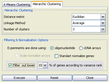
The loaded data can be normalized and clustered using either k-means or hierarchic clustering methods through the "Cluster Analysis Dialog". As an example, we use hierarchic clustering with the parameters "Euclidian Distance", "Average Linkage" and "3 clusters" (see Figure 8). We also filter out lower 10 percent of genes according to variance rank. Since GDS170 is conducted on Affymetrix GPL80 oligonucleotide arrays, we also select the corresponding array type.
Upon pressing "Execute" button, the PATIKA server will perform clustering with specified parameters, and send the result file in the XML-based PATIKA Cluster Analysis File (".pcaf") format. This file can be persisted for later use.
Cluster Visualization
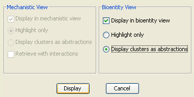
As desired, ".pcaf" files can be loaded (using "Load Cluster Analysis File") and visualized (using "Cluster Visualization Dialog") in PATIKAmad. Depending on the type of the current view, user has different options.
Basically clustering information can be visualized in two ways. One is using the highlighting facility in PATIKA. That is, each cluster is assigned a unique color and all biological objects in that cluster are highlighted with this color.
Alternatively, a regular abstraction (a meta node to signify a logical grouping of pathway elements) is created for each cluster containing only the objects in that cluster.
In our example, we will visualize the clusters on a sample bioentity-level model of PPIs, obtained by a neighboorhood query (4-neighborhood of protein bioentity "SPAG5") from the PATIKA database.
Upon pressing the "Display" button of the "Cluster Visualization Dialog", one of the views in Figure 10 is obtained depending on the visualization option selected.
)
)